The Tooltip has become a common resource and is used by all the major sites to describe a link or give more help and information on a section of text.Often when using Google products you will see a small question mark that you can hover over to see a pop up with more information.I covered tooltips before using html, javascript and images to create the actual pop up.In this post however i have a really cool way to have tooltips on your blog using just Css.If your not too savy when it comes to this sort of thing, basically this is much easier, much faster to load and presents less chance of errors.
| “..The tooltip or infotip is a common graphical user interface element. It is used in conjunction with a cursor, usually a mouse pointer. The user hovers the cursor over an item, without clicking it, and a tooltip may appear—a small “hover box” with information about the item being hovered over..” |
The Demo
The words that have tooltips attached have a grey background, when hovered over the tooltip appears with a small question mark beside the cursor.
Add The Pure Css Tooltips To Your Blog
To use the tooltips on your blog you need to first add the Css to your template, we will add it via the template designer so its very easy.You then just add some tags around the words or sentences you want to have tooltips.This works across the browsers, although IE wont have the transparent effect on the actual tip it still looks great.
Add the Css to your blog
Step 1. In your Blogger dashboard click > Design > Template Designer :


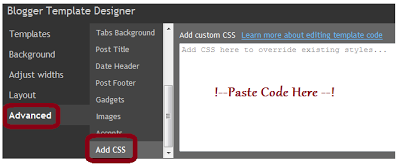
Step 2. In the template designer click > Advanced > Add Css > :

Step 3. Copy and paste the following code into the section with ‘Paste Code Here’ in image above :
.tooltip
{
position: relative;
background: #eaeaea;
cursor: help;
display: inline-block;
text-decoration: none;
color: #222;
outline: none;
}

.tooltip span
{
visibility: hidden;
position: absolute;
bottom: 30px;
left: 50%;
z-index: 999;
width: 230px;
margin-left: -127px;
padding: 10px;
border: 2px solid #ccc;
opacity: .9;
background-color: #ddd;
background-image: -webkit-linear-gradient(rgba(255,255,255,.5), rgba(255,255,255,0));
background-image: -moz-linear-gradient(rgba(255,255,255,.5), rgba(255,255,255,0));
background-image: -ms-linear-gradient(rgba(255,255,255,.5), rgba(255,255,255,0));
background-image: -o-linear-gradient(rgba(255,255,255,.5), rgba(255,255,255,0));
background-image: linear-gradient(rgba(255,255,255,.5), rgba(255,255,255,0));
-moz-border-radius: 4px;
border-radius: 4px;
-moz-box-shadow: 0 1px 2px rgba(0,0,0,.4), 0 1px 0 rgba(255,255,255,.5) inset;
-webkit-box-shadow: 0 1px 2px rgba(0,0,0,.4), 0 1px 0 rgba(255,255,255,.5) inset;
box-shadow: 0 1px 2px rgba(0,0,0,.4), 0 1px 0 rgba(255,255,255,.5) inset;
text-shadow: 0 1px 0 rgba(255,255,255,.4);
}

.tooltip:hover
{
border: 0; /* IE6 fix */
}

.tooltip:hover span
{
visibility: visible;
}

.tooltip span:before,
.tooltip span:after
{
content: "";
position: absolute;
z-index: 1000;
bottom: -7px;
left: 50%;
margin-left: -8px;
border-top: 8px solid #ddd;
border-left: 8px solid transparent;
border-right: 8px solid transparent;
border-bottom: 0;
}

.tooltip span:before
{
border-top-color: #ccc;
bottom: -8px;
}
Note – The highlighted sections are the colors of the tooltips and can be changed to suit your blog.See some color options here – Color Chart.
Step 4. Click apply to blog in the top right of your screen to save, we now have the Css in place to create the tooltip next we will see how to add the tool tip to text.
Adding the tooltip to text
When writing a post and you want to add a tool tip to some text you do it as shown below :
<a href="#" class="tooltip">
The Text That Will Have A Tooltip
<span>The Actual Description That Appears On Hover</span>
</a>
So on the demo page you seen the first tooltip is coded like this :
<a href="#" class="tooltip">Phasellus fermentum <span>This is the tooltip description</span></a>That’s a Css only Tooltip, credit goes to Red Team Design.
Drop your comments and questions below.


